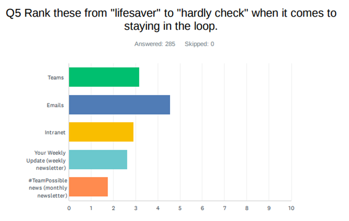
In our recent survey, you indicated that the intranet is number 3 on your lifesaver – hardly check ranking, so we know it’s important to you. And it’s important to us too!
We are always looking for ways to make the intranet more accessible and useful to all, and this is another step towards that.
So what’s changed?
✅ Carousel
The first thing that you will notice is that there is now a carousel banner at the top of the page.
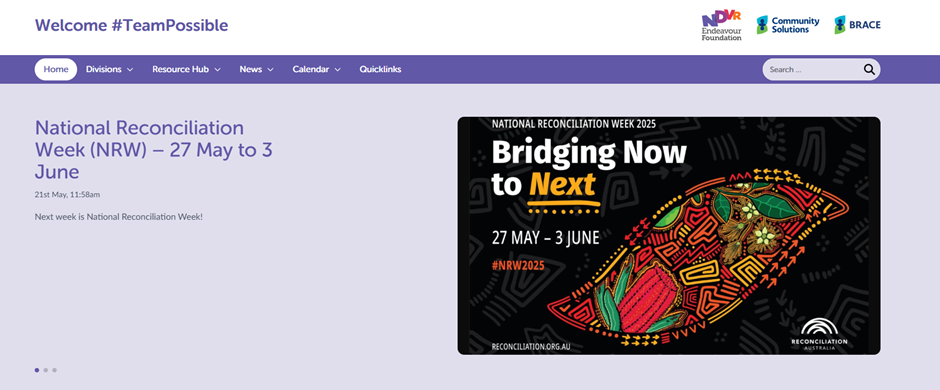
This feature will allow us to highlight projects and stories that are of significance in the organisation. It will mean that if your division has something important to share, it can be added to gain more attention.
✅ Fonts
You will also notice that the fonts are clearer and cleaner (and absolutely on brand 😉).
✅ Buttons and bits
Buttons have been rounded off to make it visually cleaner.
✅ Menus
Menus go down the page in alphabetical order. They are highlighted in purple when you hover over them to show your selection.
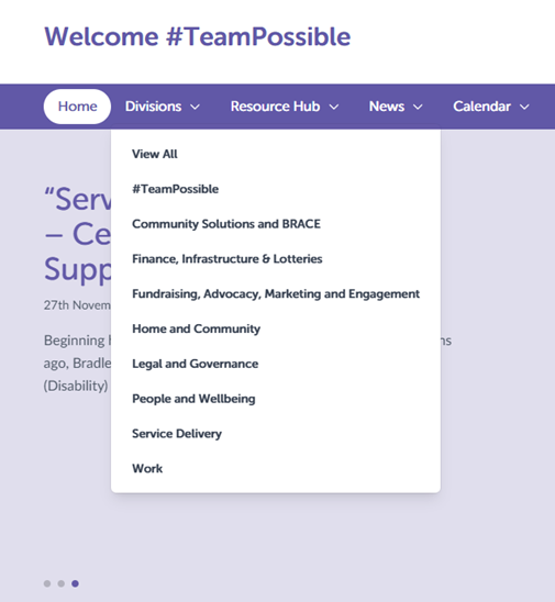
And yes – the menu for the Divisions and Resource Hub are the same as they are both categorised by division to help you find what you need quickly.
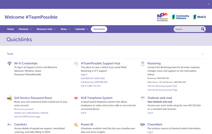
✅ Quicklinks
Fresh look in the heading – no changes to functionality.
What has remained the same?
Absolutely everything else.
This update has simply been a refresh, and we all love a little refresh!
If you can’t find something you’re looking for, please reach out to the Communications and Engagement team and we will help get you back on track.
News
View all
Director Election Expression of Interest

Are you in email overload?
Grant funding brings new life to Alex Hills L&L

BRACE proposed changes
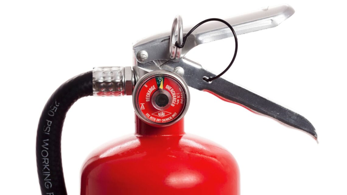
Fire Services – Chubb Fire & Security is our new provider